Nanakusa
Authentic Japanese cooking in Glasgow's West End, already the real thing when we met it. Our job was the telling: making the brand, the photography and the menu say why, before a diner has ordered anything.
What we did
An identity with conviction
A bold, painted brand rather than a safe logo. It reads as considered and premium the moment you see it, which is what an authentic West End kitchen deserves.
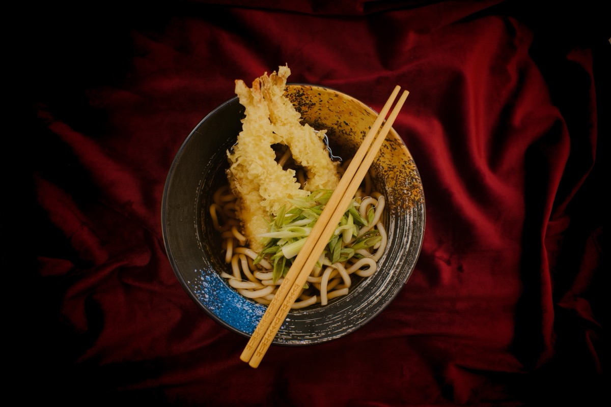
The red-velvet photography
Shot by us, in the restaurant, in a moody editorial style on red velvet that looks nothing like the bright flat photography most of Glasgow settles for. One library now runs across the menu, the website and social.
The one-sheet menu
A single sheet diners actually read, built around what people want a second round of, and reorder from without leaving the table. The old menu ran to pages customers never got through.
Every touchpoint, one restaurant
Website, booking, photography and menu all feel like the same place, down to the in-venue TV running as a channel of its own. We work with Nanakusa as an ongoing partner, not a one-off project.
The outcome
- Nanakusa reads as a more considered, more premium restaurant since the redesign.
- Average spend per cover has risen since the redesign.
- One photography library runs across the menu, the website and the Instagram grid, replacing phone snaps and stock.
- We are still at the table, making it better as the restaurant grows.